Choosing Colours for a Flower Arrangement

Colour forms the basis of everything done by a florist. It can evoke feelings of serenity passion, joy and even sadness so it is something that should be at the forefront of your mind every time you begin a design.
Colour attracts the eye – stunning red roses, gloriously bright yellow daffodils. And when these flowers are in their natural environment, in gardens or fields, colour never clashes. It is when we bring them into the home that you have to be more aware how colour can change a setting.
 Colour adds warmth – blue flowers can make a room feel cold, while oranges or red add instant warmth to wherever they are.
Colour adds movement – deep or vibrant colours such as reds, oranges or yellows are known as advancing colours because they stand out more and seem to draw you in. Blues and violets are receding colours because they appear to be in the background and green is a neutral colour because it is generally used as an accompaniment.
![]()
Colour Wheel
When you start training as a florist, one of the first things you do is surprisingly not with flowers! What you actually do is get out your water colour paints and create your very own colour wheel devised of 12 colours. This may seem very basic but it is incredibly practical for a florist, the colour wheel after all is devised to show the natural harmony between all the colours.The colour wheel is made up of:
- Three primary colours – red, blue and yellow
- Three secondary colours – violet (blue and red mixed); green (blue and yellow) and orange (red and yellow)
- Six tertiary colours – red/orange; yellow /orange; red /violet; blue/ violet; blue/ green; yellow/green.
- Colours such as white, black and grey are neutral colours which are added to the other colours to produce a hue, tine or shade.
Basic Colour Harmonies
- Complementary – two colours, tints or tones which are directly opposite each other on the colour wheel.
- Near complementary – a colour and one of the two other colours which appear beside the complementary colour opposite.
- Split complementary – made up of a colour harmony with the colours either side of its opposite complementary colour.Contrast – using a colour with one that is four sections away (one of the other primary colours).
- Monochromatic – using just one colour.
- Polychromatic – basically using colours from the whole colour wheel.
- Analogous – use of similar colours.
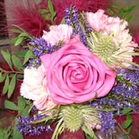
 Obviously colour is very subjective and it is all a matter a choice. It should never be underestimated as to what mood it can create and what instant affect it can have. It’s very exciting to work with and you can have lots of fun experimenting – certainly the Dutch floral designers have been forefront in broadening our minds with fabulous mixings of colour which are now very popular i.e. oranges and purples.
![]() Naturally we all have different ideas about what colour goes with what. But really it is worth sticking to the colour wheel and its harmonies if you are doing a display or design for someone else - unless obviously it is a customer who wants something totally way out with colours that generally aren’t used together!
Naturally we all have different ideas about what colour goes with what. But really it is worth sticking to the colour wheel and its harmonies if you are doing a display or design for someone else - unless obviously it is a customer who wants something totally way out with colours that generally aren’t used together!

Re: Using Floral Foam
Hi im making wreaths and centre pieces using wet foam...my problem is that the foam still drips when I've done my arrangement...is it best to…
Re: Create Longer Lasting Floral Displays
Hi All! Do Alstroemerias last in an oasis arrangement? Please advise. Many thanks and sunny greetings Kris
Re: Create Longer Lasting Floral Displays
Hi I am doing an underwater display with silk red roses covering all roses with the water adding wax chystals on the…
Re: Create Longer Lasting Floral Displays
How many chrysants do I need for a DAD tribute when purchasing 20 stems per bunch. Thanks Treez
Re: Create Longer Lasting Floral Displays
I was wondering if I could make my arrangement with floral foam self watering by adding cotton string to a reservoir…
Re: Create Longer Lasting Floral Displays
Hi I am making son and brother funeral flowers using chrysanthemums the funeral is on a Friday will it be OK to make…
Re: Create Longer Lasting Floral Displays
I have heard that England was going to bane oasis and had a new black oasis that was more environment safe. Do you…
Re: Create Longer Lasting Floral Displays
I heard there is new oasis that's black and better for the environment. Can't seem to find it. Can you help?
Re: Creating a Victorian Posy
Hi, carrying out a little research, on Posies, due to the book I am writing concerning a Victorian Gent of the 1800's. Yes he had…
Re: Create Longer Lasting Floral Displays
Hi i haven’t done any funeral wreaths before, but wanted to do the DAD letters, as my dads just died. I have watched…